How it works ?
Pick a Race Week — Pick a session — Pick your data views — Open up your favorite snack (Pringles for me, Salted Peanuts for my teammate) and Analyse.
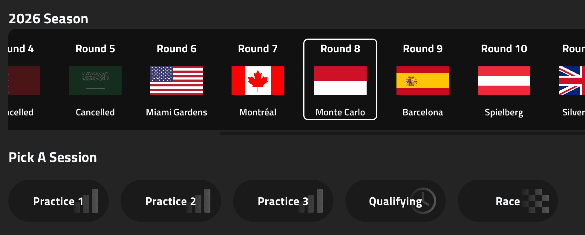
View 1: Session Selector
Every analysis starts here. Browse the season by race week, then lock in the session you care about — practice, qualifying, sprint, or race.
Meeting cards show the round, circuit location, and cancelled events at a glance. Once a session is selected, every other view on the board loads against that same context.
Change the meeting or session and open tiles reset, so you always know you’re comparing apples to apples.
View 2: Leaderboard
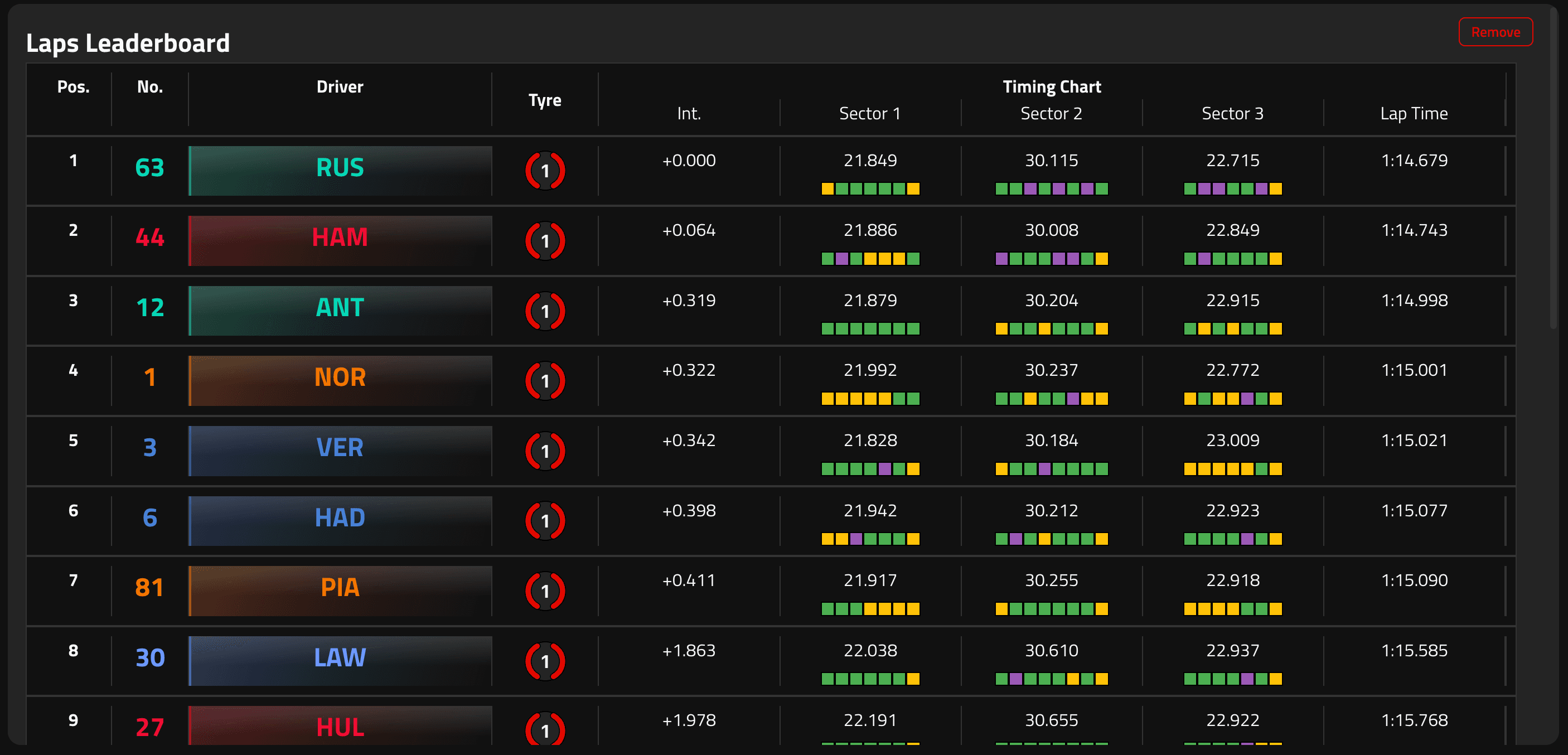
The field, ranked by best lap. See position, gaps, sector times, and the tyre that set the time.
Mini sector colouring highlights overall bests and personal bests so you can spot who owned which part of the lap without digging into raw telemetry.
Use it as your quick scan before diving into head-to-head or stint work — who’s on pace, and by how much.
View 3: Lap Head to Head
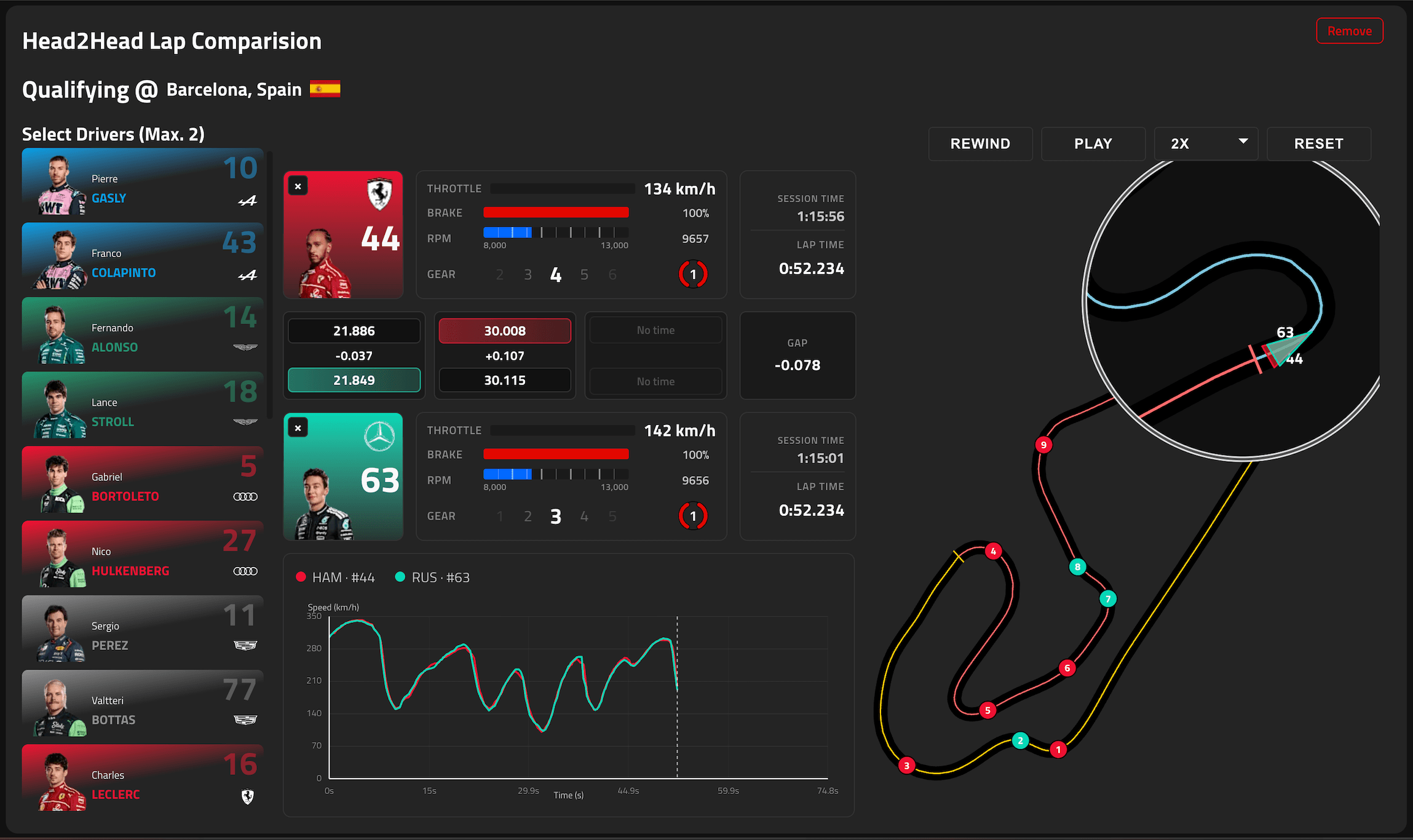
Pick up to two drivers and replay their best laps on a shared clock. The track map, car telemetry, and live readouts stay locked in sync.
Hover the track map to zoom in on any stretch of the circuit, compare sector strips as each car crosses, and read the running gap while throttle, brake, RPM, and gear update in real time.
Playback controls let you scrub, change rate, and re-run the lap so you can study the exact corners where one driver pulls ahead.
View 4: Long Run Breakdown
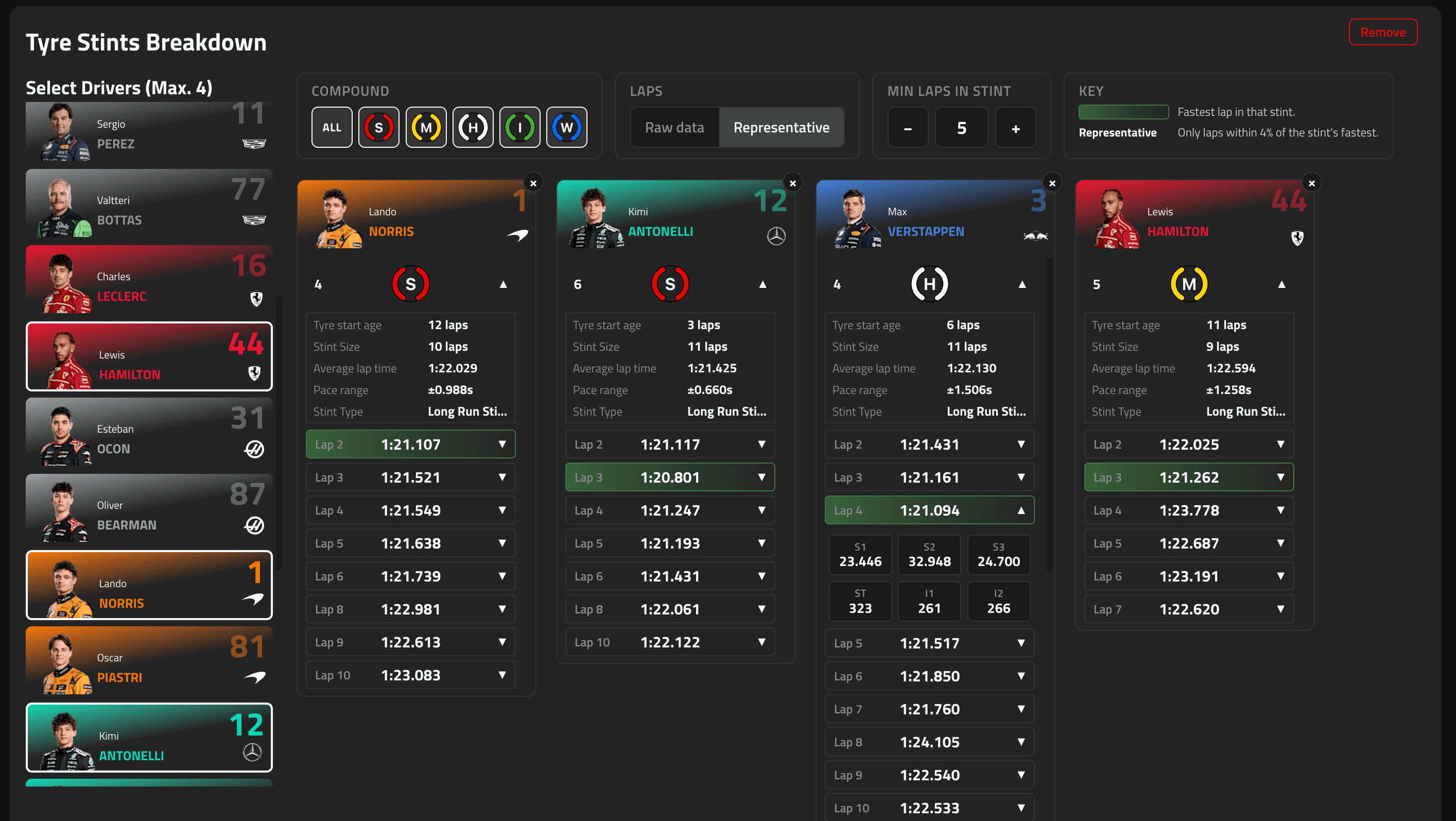
Built for practice long runs. Compare tyre stints across up to four drivers — lap sequences, stint summaries, and pit points side by side.
Filter by compound, switch between raw and representative laps, and set a minimum stint length so noisy out-laps don’t muddy the picture.
Expand a stint to see every lap bar and find where pace held, faded, or spiked relative to the rest of the run.
View 5: Tyre History and Consumption
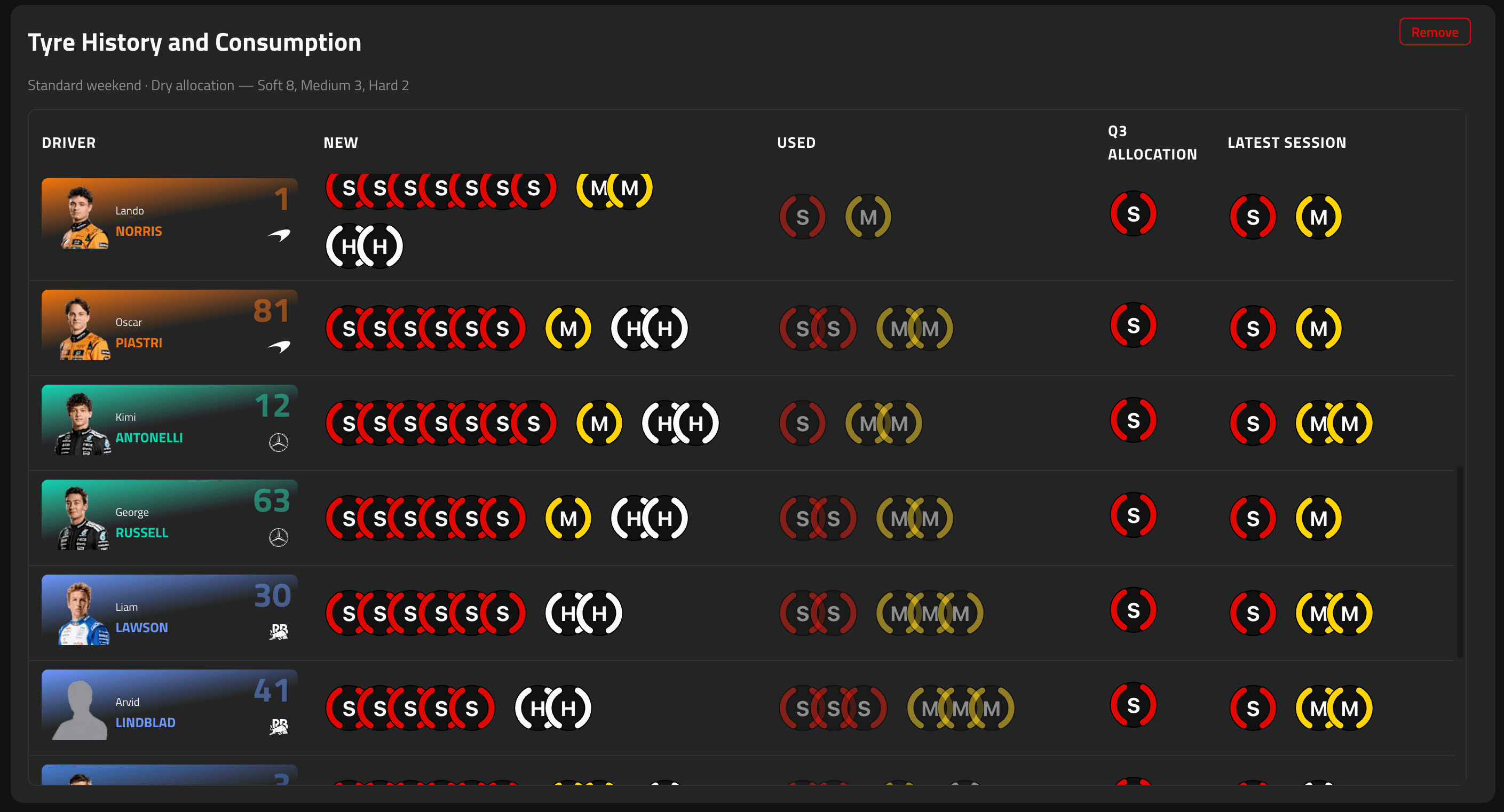
Weekend tyre inventory at a glance: what’s allocated, what’s been used, and how many new sets remain.
Stacked compound icons show new versus used rubber per driver, grouped by team so you can scan the garage in one pass.
Handy before qualifying strategies — spot who’s burned Softs early and who still has fresh sets for the sharp end of the weekend.
View 6: Race Pace Mapping
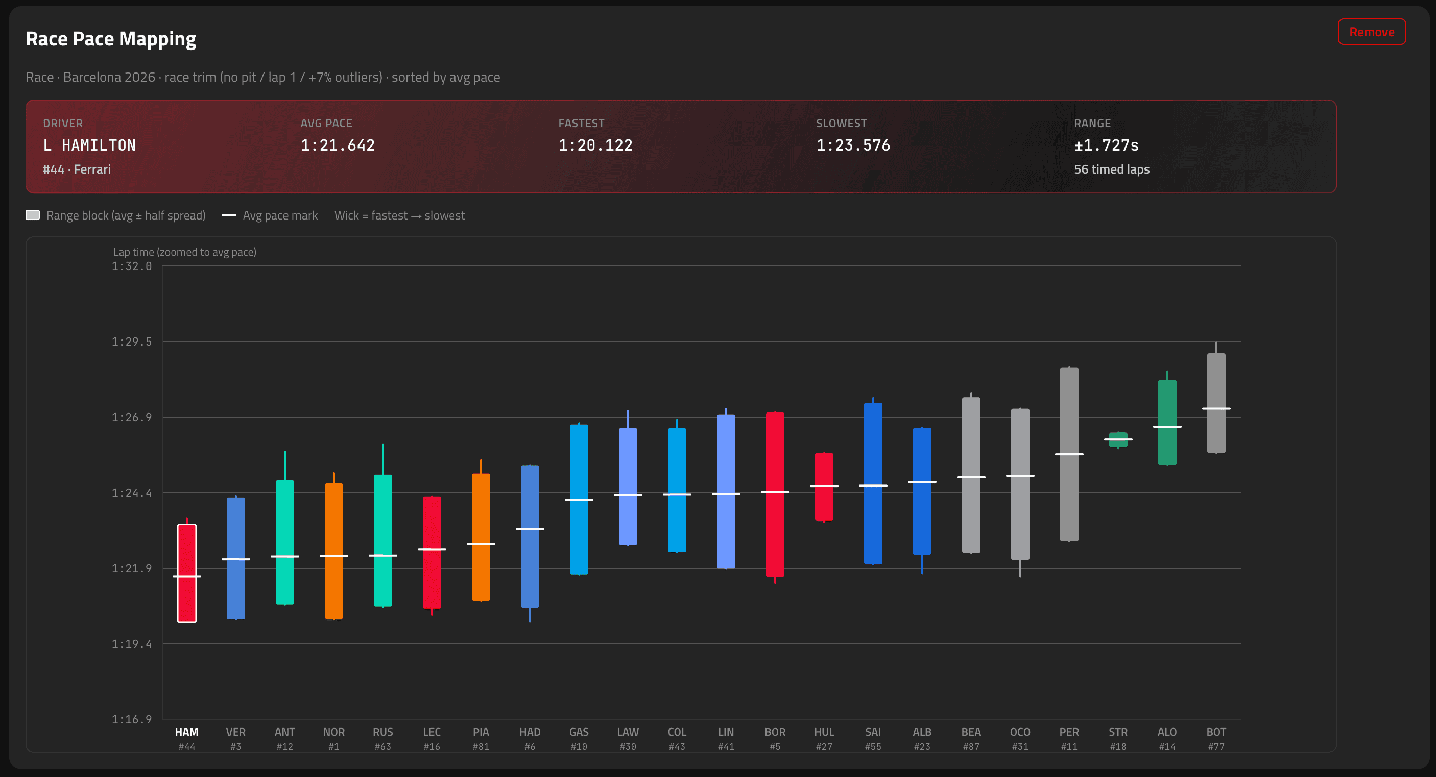
Race sessions only. A candlestick chart of each driver’s race pace after trimming pit-out, pit-in, lap one, and obvious outliers.
Average pace sits in the body of each candle; wicks show the fastest and slowest representative laps. Sort order follows average pace so the field’s true race order jumps out.
Select a driver for a summary tile — average, range, and lap count — so you can brief race pace without a spreadsheet.
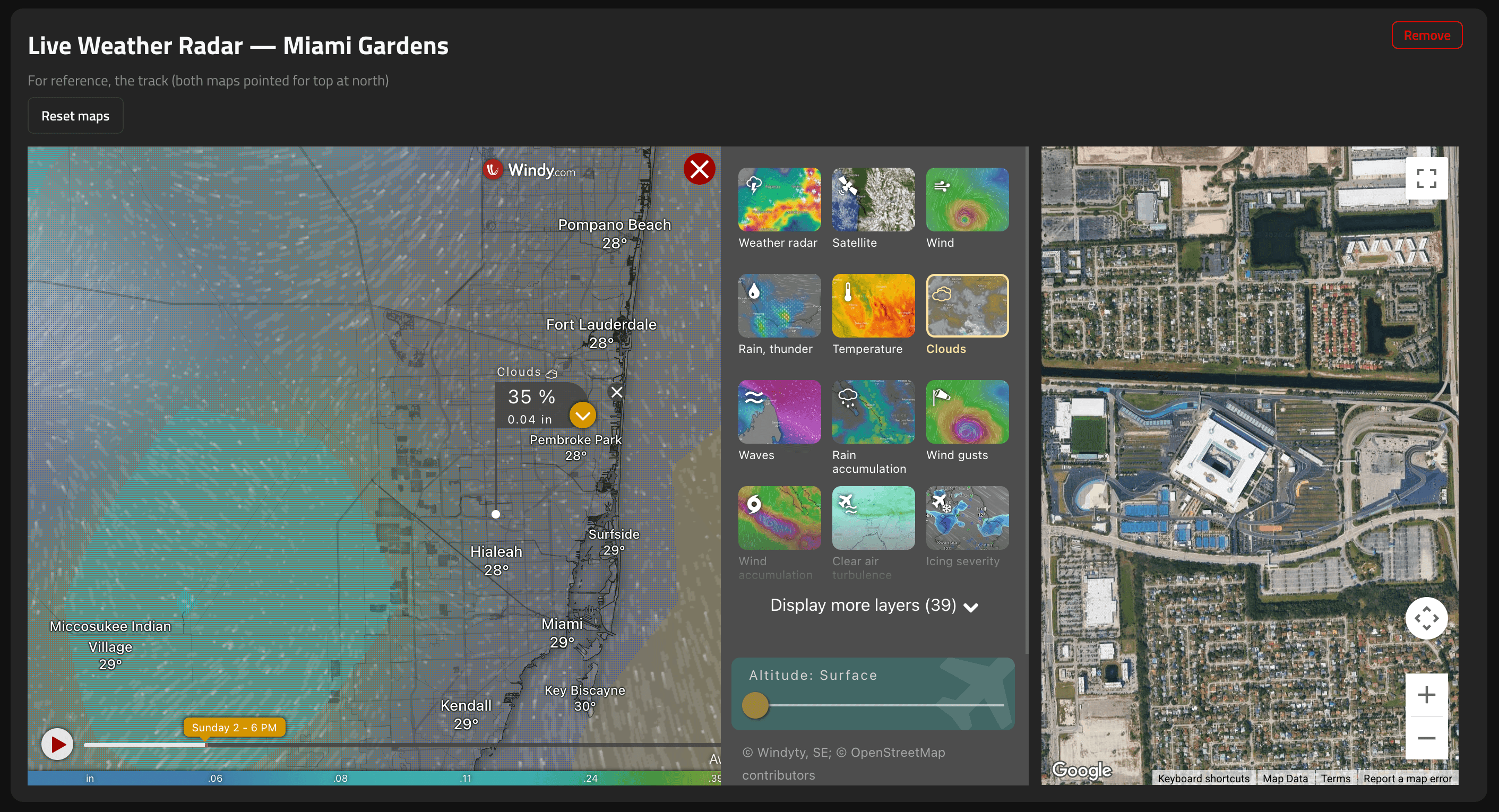
View 7: Weather Radar
Venue context without leaving the board. A Windy radar sits beside a north-up map of the selected circuit.
Needs a meeting selected so the maps know which track you’re looking at — no session required.
Reset both maps anytime when you’ve panned away. Perfect for checking if a rain band is actually heading for turn one while you read the leaderboard.